Learning session 09: Design principles in theory
🚁 Topic
In today’s learning session I studied more about design principles, where I learned 11 principles that you should indicate in your design product.
They can help upgrade your user experience and be an enjoyable journey for all users.

🤓 What I learned
The principles of design help create a design that guides users’ attention, keeping them engaged and helping them achieve their goals.
There are 11 Design principles that will have a great impact on your design project. Let me tell you what I learned today…
Unity design principle
Unity is the principle of design that holds together all other principles within work, and allows individual elements to coexist with each other to form an aesthetically pleasing design.
Ultimately, it’s the uniformity that gives a design a consistent look, even if components vary in size, contrast, or style.
Why is unity important in design?
Without unity, what appears to be a complete product can be unintentionally confusing and even unusable, which has a huge impact on user experience.
It can lead elements to compete with each other, creating an experience that isn’t intended to. Unity is all about providing a specific message about the subject being researched.
It defines the problems in a product in progress, the needs to be solved, and the users who will benefit from the solutions it provides.

Alignment design principle
Another step for creating a good user experience is the structure and the organization of elements in a product. When everything is organized, all the elements are in the right places the users will know where to look. A quickly achieved goal is valued the most by users.
When implying alignment in your product, it makes the design look cleaner and more structured.
Alignment is a fundamental principle in design, but sometimes it can be ignored by users, until they compare two interfaces, one of them having a good alignment and one not having alignment at all. Then users would easily spot the differences.
The main goal of alignment is to create an organized product in which the elements will connect with each other. As a result of using this principle, we will have an easy-to-read product as well as a good user experience.
Two types of Alignment
There are two main types of alignment:
- Edge Alignment (top/bottom or left/right)
- Center Alignment is a (vertical and horizontal alignment)

Why is alignment so important?
Alignment is mainly important to the aesthetic of digital products. This is a great way to impress users who are interacting for the first time with your product.
It also improves the organization which helps the user to interact and navigate easily and painlessly.
For example in an organised room, you can find whatever you want easier, but if the room is messy, we will have to put more effort into looking (Well, in most cases 😅).

Proximity design principle
This principle focuses on the closeness between elements.
Similar elements should sit close to each other. On another hand unrelated should be visually separated.
Proximity helps designers accomplish two main goals. One is to reduce crowded layouts and the other one is to group related elements.
Proximity includes balance and visual hierarchy.

I came across this experiment of two german psychologists, for a set of rules that explains how people see the world, and one of them is the proximity principle.
“In the early 20th century, Max Wertheimer, Kurt Koffka, and Wolfgang Köhler who were german psychologists explored how people visually perceive the world. Based on the results of their experiments, they’ve defined a set of rules that explains how people portray the complex world around them. Proximity is one of the gestalt principles. User interface design also modern graphic relies heavily on this principle.”

Balance design principle
Visual balance is achieved when elements are evenly spaced within the user interface. This way the design feels complete. Designers can emphasize different visual elements with color, orientation, position, shape, texture, and weight for balance.
In the world of design, balance is the distribution of design elements. Large and dark elements appear heavy, while small, light elements appear lighter.

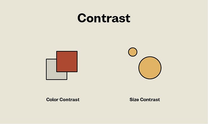
Contrast design principle
To put it short contrast makes elements differ from each other.
It is one of the key factors in design that influences the readability and visual hierarchy of web pages along with mobile screens.
This allows designers to present layouts in a way that informs the user of key and secondary interaction points. Contrast is effective in drawing the user’s attention as well as making the users interact with a specific action in your product.

Why is contrast important?
The human eye has a natural tendency to notice a contrast even in everyday life as well as in products.
Contrast and color are vital to accessibility. Contrast is the core thing for people with poor sight and visual disabilities, where this principle allows them to distinguish elements or objects.
Emphasis design principle
The main key point of emphasis principle is to bring attention to a specific visual composition. Designers use emphasis in their products to catch users’ eye with an important element.
Highlight where you want your users to look first and all the attention should be directed towards.
Other forms of contrast that you can use to create emphasis are:
- Scale Contrast
- Type Contrast
- Shape Contrast

By using emphasis with the combination of other design principles like contrast, white space, and movement, you can emphasize important elements or content.
Repetition design principle
When I first saw this principle my mind immediately went to someone who tells the same story again and again. Boring… But I didn’t how important is this to the User Experience
Repetition simply means repeating one element over and over again in a design.

It provides a consistent user experience. By repeating elements in this way, not only that we give users what they expect, but also improve the user experience. Our consistency makes our users comfortable while interacting with our product because human brain can easily detect patterns.
A pattern is a simple repetition of multiple design elements that work together.
Movement design principle
Movement refers to the way the user’s eye moves over a design. You can make movement principles easier if you use hierarchy and specific visual elements.
It can help to catch users’ attention through your design. Combined with other design principles, movement helps users to achieve their goals, where they can complete tasks without headache.
Designers can guide users through a product while using:
- 🎨 Colors — Brighter colors are recognized first
- 🔺 Shapes — Bolder and larger shapes stand out from the rest
- 📐 Alignment — Catching users’ eye while aligning the content
- 🅰️ Font — Bold and large fonts are first to catch the user’s eye.

Negative space design principle
Negative space or white space, is the area of the layout that is left blank.
It can affect not only the objects you place on your layout but also between and within objects.
Negative space is a kind of a breathing space for all objects on the page or screen. It not only defines the boundaries of objects but also creates the necessary connections between objects according to Gestalt principles to build effective visual performance.
“White space is like a canvas, a background that holds design elements together and makes them stand out,” says Mads Soegaard of the Interaction Design Foundation.

Hierarchy design principle
Visual hierarchy is the principle of arranging items to show their order of priority. It presents the content of the application in a way that let the user understand the importance of each element.
Here is a quote from Nielsen Norman Group for hierarchy:
“Visual hierarchy controls the delivery of the experience. If you have a hard time figuring out where to look on a page, it’s more than likely that its layout is missing a clear visual hierarchy.”

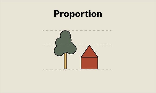
Proportion design principle
Proportions refer to the relationship between objects in terms of their size and visual weight. This is one of the easiest principles to understand from other design principles. It only focuses on comparing the shape and size of an element to others.
For size, if you make an element large it will catch users’ attention immediately, and users understand it easily which is an important element of the product.
For visual weight, because of boldness the headline catches our eye first as we go through a product.
For example, the relationship between the vertical and horizontal paintings in a wall hanging may be pleasing because the unequal lengths will produce an interesting contrast, which will catch our attention.
🤺 What challenged me
Learning about design principles is a fun thing to do, but it can also be challenging.
I had some difficulties learning about how repetition is not a boring process, but it’s important to imply it into a product.
After seeking on some Product Designers for help, I started to learn what a huge role Repetition has in a piece of design.
These 11 principles go as the honey with a pot, if you use them in your product you have created a successful user experience product.
If all of this theory seemed boring or you didn’t understand it really well, please stay tuned for my next article which talks about applying these rules into practice. As always, I am so grateful that you come with me this far. Any feedback or critique is welcomed and appreciated! ♥️


