Learning session 10: Design principles — Deep dive and my tries
🚁 Topic
Design principles are pretty important, and I feel that I have even more to say about them, so let’s dive deep into design principles and also I’ll share some of my tries.
🤓 What I learned
A combination of these principles in design will help the product to communicate a message and assist the user to achieve their goals.
Unity design principle
Before you start working on a design, start by thinking about what do I want to accomplish with this design.
Do I want to share a message, also how to assist my users in achieving their goals? So start with a purpose then carry on to create a design.
The next step is to imply principles into your elements like repetition, patterns, and texture. With these principles in your product, you can help your users to achieve their goals and also to create a sense of unity in your product.
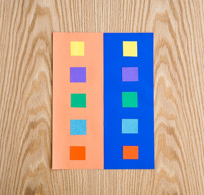
After that you can use proximity, to tell which elements are related to each other. By using proximity you can establish to tell users how those items are tied together.

Use the same style for your elements. Users don’t want to get used to new things, effortlessly and quick actions are better for users. Consistency is the key.
Choose a font that will fit the message you want to forward to users, from the product that you are creating. Typography makes a big difference, you want to fit it and make the overall visual appearance good.
Proximity design principle
Any type of visual or graphic designer can benefit greatly from the proximity principle.
The following are a few key reasons for applying this design theory:
Improve message: it organizes ideas on a page, makes it easier to share a message, and assists the users through interaction.

Clarifying text: When you combine text and images, using the proximity principle helps readers associate the images with an appropriate paragraph.
Increasing readability: You can make it easier for users to read your work while using proximity. This results in an accessible design and a good appearance.
Improving messaging: The proximity principle organizes ideas on a page, which makes it easier to share a message and tell a story through design.
Clarifying text: When combining text and images, using the proximity principle ensures that readers associate the image with the appropriate paragraph or caption.
Increasing readability: By using the proximity principle in your work, you can make it easier for viewers to read your work and move through the design. This often results in a more appealing and accessible design.
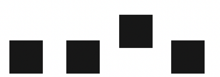
Alignment design principle
According to the alignment principle, related objects should be placed along the same axis. By applying it, issues are decreased and text may be scanned more quickly and effectively.

Some alignment types can make it simple for designers, to align the content and components in their products.
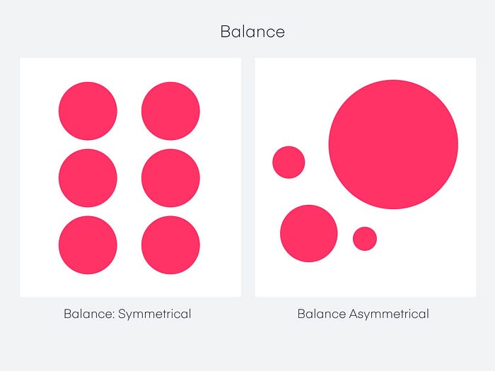
Balance design principle
How can you balance the appearance of your website?
At a conscious level, symmetry appears well-organized and harmonious. The consistent positioning of items on either side of the primary horizontal or vertical axis leads to symmetrical balance.
In other words, the two sides of the imaginary line running down the center of the page are mirror images of one another.
Asymmetric balance
A composition with an unequal balance has disproportionate weight on both sides.
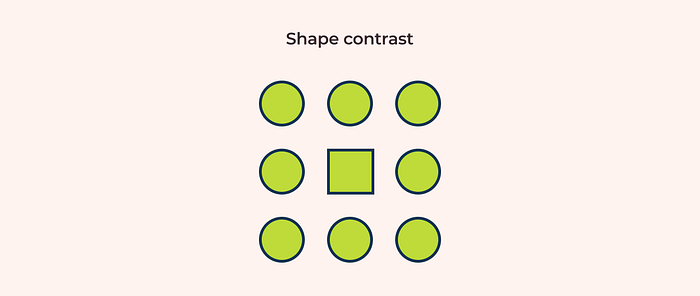
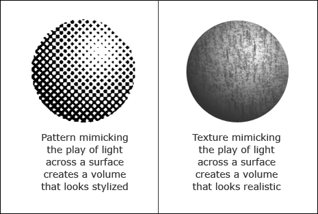
Contrast design principle
Contrast is what identifies two or more elements from one another. To achieve contrast, designers can use a variety of techniques, including color, alignment, size, shape, position, texture, and fonts.
Color: This UI element is the most natural and unique for the human eye. It works when colors are combined in different ways, for example with complementary colors, split complementary colors, etc. This form of contrast is mostly seen in CTA buttons or other navigation elements to catch the users’ eye on a product page.
Size: The main point of this type of contrast is to make an element that is destined to catch the users’ attention bigger than the other elements.
Shape: when you want to catch your users with the form of shape contrast, try to make one element’s shape different from others.
Texture: To use this form of contrast you have to use textures that are distinguished from each other.
Position: Designers change the position of one element, to make differences between others’ contents.
Emphasis design principle
Emphasis is used to attract users’ attention to a specific point. It could be any element on a page, such as a picture, button, or piece of content.
Using visual elements like color, shape, size, texture, or patterns will help you emphasize a point.
There are many tools to use to emphasize your product. Some of them are:

Lines: If you use in your product horizontal lines and you break the pattern by using vertical ones, it will stand out from the other content. Naturally, users will take that as a point where their attention is required.
Shapes: If you make a group with a particular shape, and the other group with a different shape it will stand out and it will grab attention.
Mass: using a dark-colored element with a bright-colored page is likely to emphasize the dark-colored elements from the rest of the elements.
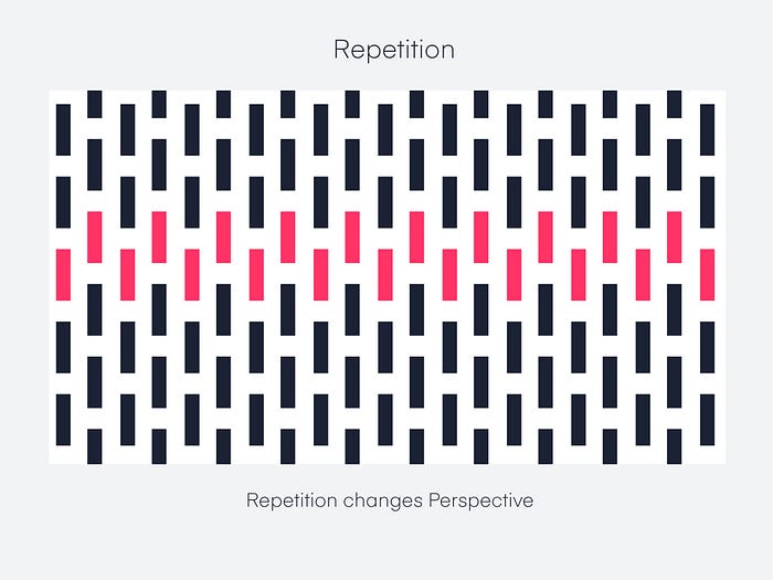
Repetition design principle
Additionally, using repeated messaging will help you get repetition. If you want your customers to remember that you are the quickest or the cheapest in the industry, you’ll need to let them know about it repeatedly.
In this case, repetition serves as reinforcement. You might recall that to memorize your times’ tables, you had to recite them often.
Repeating elements help us as designers fulfill our users’ expectations while boosting their overall experience.
Movement design principle
Digital products’ user experiences are strongly impacted by motion, yet usability is affected if interface elements don’t agree with fundamental motion design principles.
Movement in user interfaces is more than just a decorative element. It is a strong motivator that increases user interest in products and improves design communication’s scope. Our world is constantly in motion.
Negative space design principle
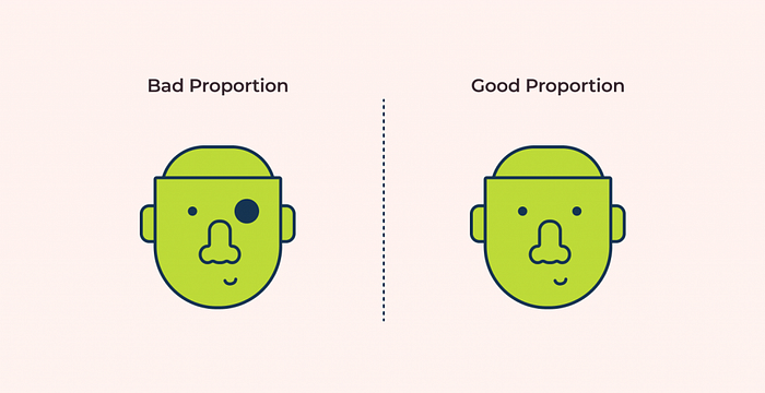
Proportion design principle
The term “proportion” describes the relationship between items in terms of their apparent weight and size. It is one of the simpler design principles to comprehend because it mainly compares how different elements’ shapes and sizes compared to one another.
We can determine whether a proportion should be used in the design by analyzing its proportions.
The choice is between:
Width, height, and the depth of elements
Size of elements
Relationship between the elements
🤺 What challenged me
Design principles are hard to learn, because there are tons and tons of information about them. For that reason, one article/learning session didn’t seem enough for me to gather all that information, so I decided to make part II talking just about them. Now, I think it’s pretty clear for me what each design principle is and how can they be applied to a design in real world.
Thanks for coming this far ❤