Learning Session 17: UI Deliverables
🚁 Topic
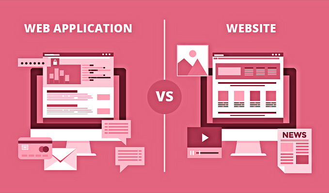
There are many different types of UI deliverables, but they all have one common goal: to help the user interface designer communicate their ideas to the client. Some common UI deliverables include wireframes, prototypes, and style guides. Here is what I learned from today’s session…
🤓 What I learned
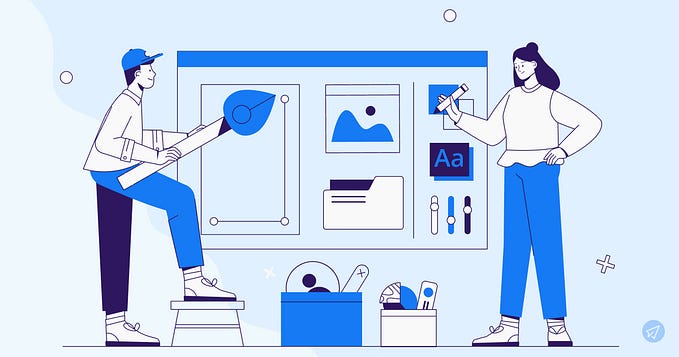
UI design deliverables include layouts, colors, grids, typography, illustrations, UI animations, and interactions.
Designers are prepared to hand off UI design deliverables when the development process comes to stakeholders, team members, and developers to get feedback on the design. Designers should begin compiling them into shareable documents as early as possible. For starters, it makes designs more consistent and user-friendly.
It saves time and eliminates misunderstandings for all team members who work on a product and refer to designs. Design deliverables are excellent tools for team collaboration and ensuring everyone is on the same page.

Mood boards
It is a collection of assets and materials that represent the language of a particular design and product.
Mood boards are the first step of the deliverables you might create during the design process. The purpose of mood boards is to present to a client, to ensure that you are on the same page about the product’s general look and feel.
A good mood board will define an emotional experience, and everything else is there to support that experience. Mood boards can be in two ways digital or physical boards and include things like logos, color palettes, typography, images, and sketches.
They give the client and other stakeholders an idea of the design’s intended direction. Specifics of the design are still easily changed at this stage, so gathering feedback on whether the designer’s ideas match the clients is incredibly useful.

Type systems
As part of the mood board, designers include the product’s type system. The type system contains typefaces, font sizes, weight, line height, and the letter spacing that the design will use.
We also have to keep in mind to do a typographic hierarchy. The type system is an essential component of establishing an effective design system.

Design systems
A design system is a sharable language that allows everyone on a team to communicate ideas in a unified and concrete manner.
Design systems may include design patterns, code snippets, style guides, design resources, and non-tangible things like brand value, mindset, and beliefs.
The main goal of design systems is to reduce inconsistencies by using existing components rather than creating each element from scratch. Design systems save designers time and also support team collaboration. For example, you can use the same button anywhere a CTA is needed, rather than creating every time a new one.
You can create a design system from zero or use an existing one, such as Google’s Material Design. You’ll need to consider if your product would benefit from an existing, recognizable design system.
For example, if you’re creating an Android app, using Material Design will likely provide a better user experience than starting from scratch.
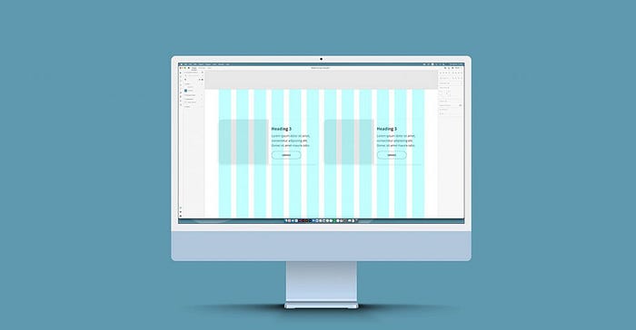
Grid systems
The grid system you’re using is another component of your design system. Grids are essential for organizing the content into structured propositions, making the product look visually pleasing and readable.
The grid system includes straight vertical and horizontal lines that help designers align the content consistently throughout the project and across different screen sizes.
Grids also enhance the visual hierarchy and make the design complex, where it appears logical and uncluttered. They help the designers lay out the components without spending time calculating the spacing for every element.
Design handoff
After designing the product, if designers are satisfied with their design, they will create a document that includes all the details and digital assets required for the development team to put meat to the bones.
This is the design handoff process. The document will contain mockups, interactions, accessibility validations, and necessary assets for the developers to release the product.
Designers should communicate with developers during the design process to ensure that assets can be implemented within the project’s timeframe and budget.

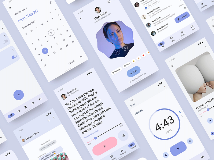
Mockups
Mockups are an essential step of the design handoff. Mockups are full-size models of devices that demonstrate how your designs will appear in real life. They can help developers to assess the functionality of the design and also see the visual appeal.
Mockups are also an excellent way to show the stakeholders how the design looks before it is handed to developers. They can be distributed to clients and other stakeholders, as well to use for user testing use. Mockups can also be used in your portfolio to make your designs look more professional and illustrative.
A mockup, as a “static design,” lacks the functionality of a live website. A mockup, unlike a website, would include a colored CTA button that, when clicked, would not open a form. A mockup may include a cover image at the top of the page, but unlike a website, it will not include an active slideshow.

Icon sets
Icons are an essential part of interfaces, visually expressing actions and ideas. Among the assets in the design handoff is icon sets. They communicate the core idea and intent of action and bring benefits to user interfaces, such as aesthetic appeal and saving screen real estate.
Most websites and apps have icons. It’s a design pattern that users are familiar with it. While wireframes may include icons, they’re often not finalized until the mockup stage.
You can create icon sets for your design, but you can also use exciting icons.

🤺 What challenged me
When I first started learning about UI deliverables, I was challenged by the sheer volume of information that was available on the topic. I felt like I needed to learn everything at once in order to be successful. However, I quickly realized that this was not possible, and that I needed to focus on one thing at a time.
I also found it difficult to find concise and clear definitions of UI deliverables. Thankfully, I was able to find a few helpful articles that provided me with a better understanding of what UI deliverables are and how to create them. Overall, I am grateful for the challenges I faced while learning about UI deliverables, as they helped me to better understand the topic.
Thank you for coming this far. Any feedback or critique is appreciated.❤️


