Learning session 25: UX Copy
Topic
User experience (UX) copy is the text on a website or app that helps guide users through the experience. It includes error messages, calls to action, and help text. Good UX copy is clear, concise, and easy to understand. It should help users complete their tasks quickly and easily.
What I learned
UX Copywriting is the skill of producing copy for websites and apps that explains how to use a product. UX copywriting is critical to creating a product that has a valuable and pleasant digital experience.
UX copy is everywhere, from the labels on our food to the instructions on our medicine. It’s in the ads we see and the websites we visit. Even the apps on our phones and the games we play have UX copy designed to help us use them more effectively. In short, UX copy is designed to make our lives easier by helping us understand and use the products and services we encounter daily.

Avoid vague commands
When designing user interfaces, it is essential to avoid using vague commands. Vague commands can lead to confusion and frustration for users, resulting in a poor user experience. Avoid using vague commands, be clear and specific in your language, and use concrete and actionable words. In addition, provide clear and concise instructions on how to complete tasks. By taking these steps, you can help ensure that users have a positive experience with your interface.

Avoid generic commands
Generic commands are not specific to a particular task or user goal. They are usually found in menus and dialogs and are often labeled “OK,” “Cancel,” “Apply,” “Yes,” “No,” and so on. Instead of generic commands, UX designers should use specific commands tailored to the task at hand. For example, if a user tries to save a file, the command should be labeled “Save” rather than “OK.” This will help users understand what they need to do and make the task simpler.

Avoid double negatives
Double negatives are not a way to go. They are hard to comprehend and result in users spending their time analyzing what the message says.
When writing user interface designs, it is essential to avoid using double negatives. A double negative occurs when two negative words are used in the same sentence, confusing users. For example, instead of saying, “You can’t do that,” say, “You can do that.”
Using double negatives in your product may give your customers the impression that you are attempting to manipulate them into doing something they did not plan to do.

Avoid excessive politeness
Using excessive politeness can waste users’ time and also annoys them. Users want to get to the point quickly. It does not sound natural or honest to use “please” or “thank you” all the time. Furthermore, it includes needless terms that serve to slow people down.

Avoid using branding in copy
Using your brand name in UX copy is unnecessary. It can be distracting for users and take away the overall message. Also, it can create confusion if users are unfamiliar with the brand, and it will be a turn-off for users if they feel like they are being marketed.

Use an active voice
An active voice in UX design helps create a more user-friendly experience by making it easier for users to understand and navigate the design. An active voice also helps to keep users engaged with the design by making it more engaging and interactive.
In general, active voice is clearer and simpler to read. Active and inactive voices state the same thing, but the word in active voice is far more natural and easier to read.

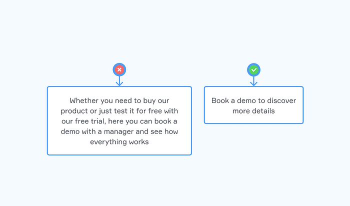
Use concise language
You may be encouraged to use flowery, lyrical language in your UX copy, but avoid it. UX text should be written in simple terms. You may also exclude articles and prepositions to make your content shorter. In UX design, it is vital to use concise language to communicate effectively with users. A concise language allows designers to present information clearly and concisely, making it easier for users to understand and interact with the design.
Use verbs for button commands
For button commands, it’s better to use a word like “Yes, Confirm” than generic words like Yes or No. As I said earlier that using generic words doesn’t tell the users what is going to happen after they click it, making the users confused and unsure if he wants to click the button.
It is important to use verbs for button commands because they are more user-friendly. Verbs clarify the button’s purpose and help the user understand what will happen when they click it. This makes for a better user experience overall.

Use adjectives to identify states.
When designing a user experience, adjectives are essential to identify states. This helps to ensure that the design is consistent and that users can easily understand the different states. For example, if a button is “disabled,” it should be clearly labeled. This helps to avoid confusion and makes the experience more intuitive.
Use the consequent state
When it comes to directives, make sure they represent the impending or subsequent state rather than the current one. Instead of repeating the obvious, tell users what will happen due to their behavior. According to the circumstances, this can be done directly on the button or label. It helps users understand the consequences of their actions.
For example, if a user clicks on a button, the consequent state can help them understand what will happen next. This can help prevent user errors and improve the overall user experience.

Lead with the objective
Leading with the objective in UX design is essential because it allows designers to keep the user’s needs at the forefront of the design process. By starting with the user’s goal, designers can create solutions more likely to meet the user’s needs and expectations. Additionally, starting with the objective can help designers to avoid getting bogged down in the details of the design process and instead focus on creating the best possible user experience.

Use numerals
Using numerals is the best way to do it if you have to include numbers in your UX copy. Numerals are scannable for users and grab users’ attention.
They save space in your design and assist in avoiding mistakes, and numbers save time during the development phase of your product.
Numerals can help users quickly and easily compare numbers. For example, if one process has five steps and another has six steps, using numerals can help users compare the two processes and understand which is longer.

Use a consistent case
A consistent case can help create a more cohesive and professional-looking design. It can also help to make the design process easier and faster and help to ensure that all of the elements in the design work together harmoniously. Additionally, using a consistent case can help improve the design’s usability and make it more user-friendly.

Use ellipses to indicate action
In a text, ellipses may be associated with word omission or a dramatic pause. They have a distinct role in UX copy. However: they indicate that an action will not be executed immediately but require further input from users. Using ellipses to indicate an action in UX design is vital because it helps to create a sense of movement and flow for the user.

What challenged me
There were a few challenges I experienced while learning about UX copy. The biggest challenge was understanding how to write for different user types and keep the copy concise yet still informative. Additionally, I found it challenging to find good examples of UX copy since it is such a new and specialized field. However, through perseverance and trial and error, I eventually overcame these challenges and produced compelling UX copy.
Thank you for making it this far.❤️