Learning session 26: Devices 💻
🚁 Topic
Learning about devices is fascinating since they are becoming increasingly important in our daily lives. They can be used for various purposes, from keeping us entertained to helping us stay connected with loved ones.
🤓 What I learned
I learned that devices, pixel, retina, adaptive and responsive design are all important factors to consider when creating a website. I also learned that it is important to test a website on different devices and screen sizes to ensure that it looks and functions correctly.
Devices
Devices are the equipment we use every day to access digital products. Devices can refer to any electronic devices like tablets, laptops, smartphones, TVs, smart watches, etc.
There are many devices that we use daily. These devices include our phones, computers, tablets, and TVs. We rely on these devices for communication, entertainment, and work. Without them, our lives would be very different.

Pixel
A hardware pixel is one of the tiny dots or squares that make up a picture on a computer screen. The density of its pixels determines the resolution of a screen.
A higher pixel density yields a more precise and sharp image. In extreme circumstances, low pixel density produces hazy and less clear pictures.
A software pixel is a measuring unit. The device maker specifies how many hardware pixels equal one software pixel, referred to as the device pixel ratio. Pixels are the basic building blocks of a digital image created using geometric coordinates.

PPI
PPI stands for pixels-per-inch and refers to the pixel density of an electronic picture device. PPI is determined using the diagonal size and resolution ratio of the screen. A higher PPI yields a sharper, crisper display.
The PPI of most current digital screens is 300 or more. Because older panels have lower PPI, pictures look blurrier in comparison. Understanding screen density and ratio is critical for designers who want to provide delightful user experiences across devices.

Retina
A retina display is a high-resolution screen used in devices such as smartphones and laptops. It gets its name because it is based on the same technology as the human retina.
The main advantage of a retina display is that it can show more pixels per inch than a traditional screen. This means that images and text appear sharper and more detailed. Retina displays also have better contrast ratios and color reproduction than standard screens.
One downside of retina displays is that they can be more expensive than traditional screens. They also require more power to run, which can shorten battery life.

Mobile design
Regarding the user experience of a mobile phone, there are a few key things to consider. First, the UX should be easy to use and intuitive. The phone’s interface should be easy to navigate, and all of the phone’s features should be easy to access.
Additionally, the UX should be responsive and fast so that users can quickly get the information or perform the task they need to.
Based on a recent date, an average person spends 3 hours and 15 minutes on their phone daily.
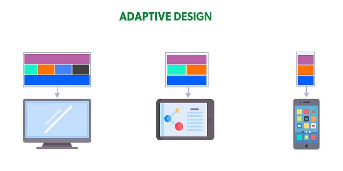
Adaptive design
The best designs are those that are customized to the specific needs of the user. This is especially true when it comes to adaptive designs designed to meet the needs of users with disabilities.
There are a variety of adaptive design strategies that can be used to create custom designs for users with disabilities. Some common strategies include using alternative input methods, providing text alternatives, and increasing the size of text and buttons.
When creating an adaptive design, it is essential always to keep the user’s needs in mind. The goal is to create a design that is both user-friendly and accessible.
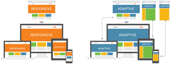
Responsive design
Responsive design is a web design approach that attempts to deliver an ideal viewing experience that is easy to read and navigate with slight resizing, panning, and scrolling.
While scrolling across a variety of devices ranging from desktop computer monitors to mobile phones. Media queries allow for conditional loading of CSS rules based on characteristics of the device the site is being displayed on, most commonly the width of the browser.
Different stylesheets are loaded depending on the device’s screen size, orientation, and resolution. This allows for a more targeted approach to CSS rules and a more efficient loading of resources — the server only sends the CSS rules that apply to the device being used.
🤺 What challenged me
I encountered a few challenges while learning about responsive and adaptive design. Firstly, understanding how to make a design responsive to different screen sizes and devices can be tricky. Designers need to think about how content will resize and rearrange itself when viewed on different devices, which can be challenging to visualize. Secondly, keeping track of all the different breakpoints and media queries needed to make a design responsive can be daunting.
Finally, ensuring a design looks good and functions well on all devices is a lot of work! It can be challenging to test a design on every possible device and screen size and ensure that everything works.
Thank you for making it this far.❤️


