Learning session 27: Login page (Practice)
My process of designing a Login page
It’s crucial to consider both the website’s appearance and usefulness while creating a login page. The page should be navigable and visually appealing.As one of my initial steps in building a login page, I started by looking up existing login pages to identify any similar design trends.
Additionally, I drew heavily from inspiration to produce a product that is both functional and aesthetically beautiful. The login form should be simple to discover, brief, and have detailed instructions on how to complete it.
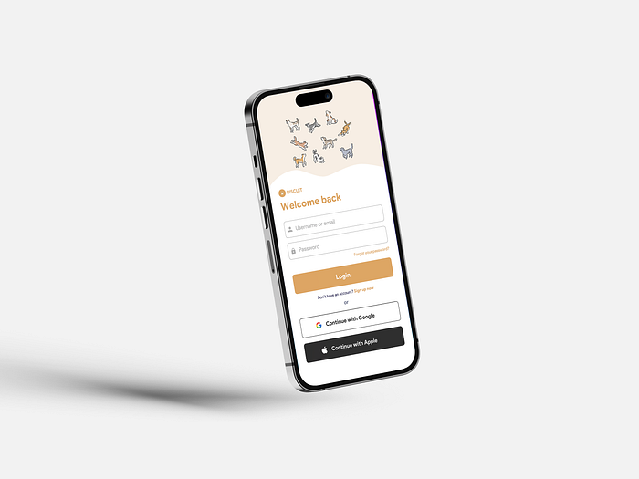
I began by drawing out a very simple layout for the login page. The barest essentials are present here, often only a few input boxes for the username and password and a submit button. I begin to add specifics after I have the broad framework. This could entail adding a logo, aesthetic accents, and other branding components, as well as creating the input fields and submit button to blend in with the site’s general design.
As a last stage, I tried the pages in the intriguing software Sketch Mirror. I noticed various problems with the margins, such as the need to raise the text’s size for readability to the bottom of the page.


🤺 What challenged me
While creating a login page for mobile design, I ran into a few difficulties. I had to make sure the input fields and buttons were big enough to be touched without difficulty on a small screen first. Additionally, I had to take careful not to crowd the page and make it appear cluttered.
Additionally, I struggled to select the right font for a dog-related app. I tried “SF PRO,” but it didn’t fit the tone of the app, then I tried “Product Sans,” and it worked well. I attempted matching some colors, but it was a complete failure. After doing some study and learning the different colour moods, I was able to choose the ideal hues for the app.
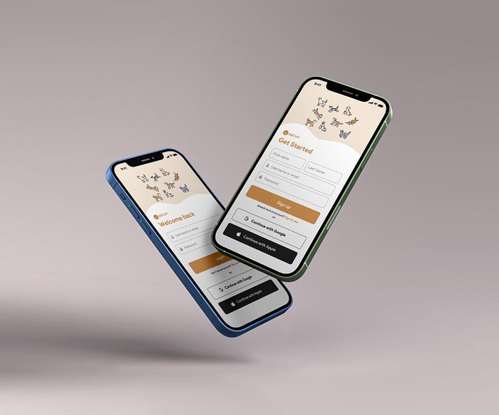
Final results
Thank you for making it this far.❤️