Learning session 29:Common Component Definitions I
🚁 Topic
In user experience (UX) design, common component definitions are those elements of a design that are repeatedly used across different screens or interfaces. By creating a common definition for each component, UX designers can ensure a consistent user experience and reduce the cognitive load on users
🤓 What I learned
We frequently see buttons, inputs, forms, cards, modals, menus, headers, and footers in suer interfaces. You’ll improve your users’ experience if you fully understand how these UI components operate and know how to employ them in your designs.
Buttons
Button is an interactive element also engaging, where allows getting the interactive feedback that is expected from the users following a specific command. It’s a control that enables users to communicate directly with a digital product and sends important commands for accomplishing a specific objective.

Checkbox
Checkboxes are a type of input element that allows users to select multiple options from a set. They are often used in forms and surveys to allow users to select multiple items from a list.
Checkboxes are also used in settings pages to allow users to select multiple options.
There are a few things to keep in mind while designing check boxes:
- To make sure the options are clear and easy to understand
- Using short, descriptive labels for the options
- Allowing users to select multiple options if needed
- Making sure the check boxes are visible and easy to click on
- Using a consistent style for the check boxes throughout the design

Radio button
Radio buttons are also an type of input element that allows users to select one option from a list of choices. They are commonly used in forms and surveys to provide a limited number of options that can be easily selected by the user.
Radio buttons are typically presented in a vertical or horizontal list, with the user able to select one option by clicking on the radio button. Radio buttons are a great way to provide a limited number of options to users, as they can easily be selected and deselected. However, radio buttons should be used carefully as they can create a lot of clutter on a page if there are too many options.

Toggle switch
A toggle switch is a type of input device that allows a user to select one of two options. The switch is activated by pressing the button, which causes the switch to change state. The switch can be either momentary or latching. A momentary toggle switch will return to its original position once the button is released, while a latching toggle switch will remain in the new position until the button is pressed again.
Toggle switches are commonly used in user interfaces to provide an on/off control. For example, a toggle switch may be used to turn the wifi on or turn the airplane mode on.

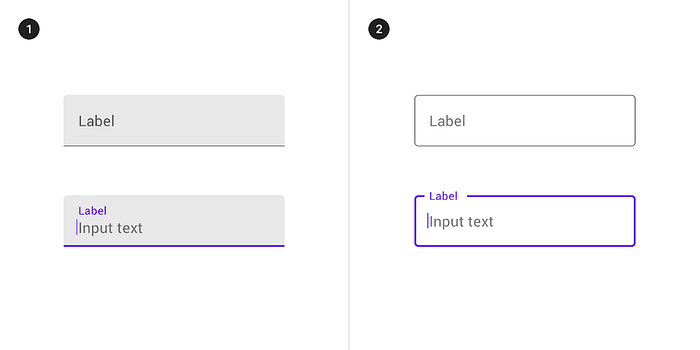
Text input
Users expect to be able to input text into a form on a website in order to search for something, fill out a form, or post a comment. Text input is an important part of the user experience on a website. The input field should be large enough to allow for easy input, and the user should be able to see what they are typing. The input field should also have a clear label so that the user knows what they are supposed to be inputting.
Menu
A menu is a list of items that a user can select from. It is a key part of any user interface, as it allows the user to choose what action to take or what data to view. The design of a menu should be clear and easy to understand, so that the user can quickly find the option they are looking for. The layout and structure of a menu can vary depending on the type of application or website it is being used for, but there are some common elements that should be included such as search, categories, and filters.

Form
A form is a way for a user to interact with a system by inputting data. A good form design will take into account the user’s needs and the expected data to be inputted, and present the form in a way that is easy to understand and use. A well-designed form will also provide feedback to the user as they input data, so that they can be sure that their data is being correctly processed.

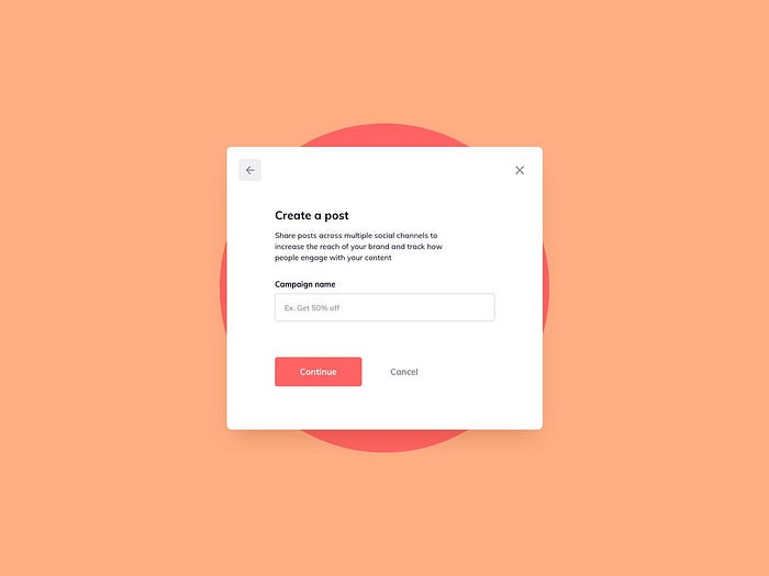
Modal
Modals are used for things like creating a new item, confirming a user’s action, or showing an error message. Modals are generally used when you want to make sure the user sees and interacts with the content of the dialog box before they can return to the rest of the app.
For example, you might use a modal to confirm that a user wants to delete an item. When designing modals, it’s important to keep them as simple as possible. The content of the modal should be clear and concise, and the actions should be obvious. Modals should also be easy to dismiss, so the user can return to the app if they change their mind.
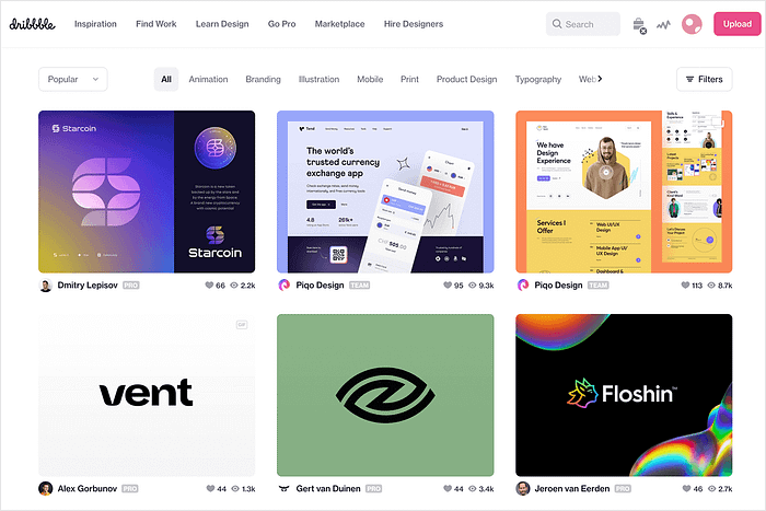
Card
Cards are a versatile tool that can be used to improve the user experience of a website or app. They can be used to display information in a concise and visually appealing way, making it easy for users to find the information they need. Cards can also be used to create a sense of interactivity, by allowing users to flip through information or move items around.
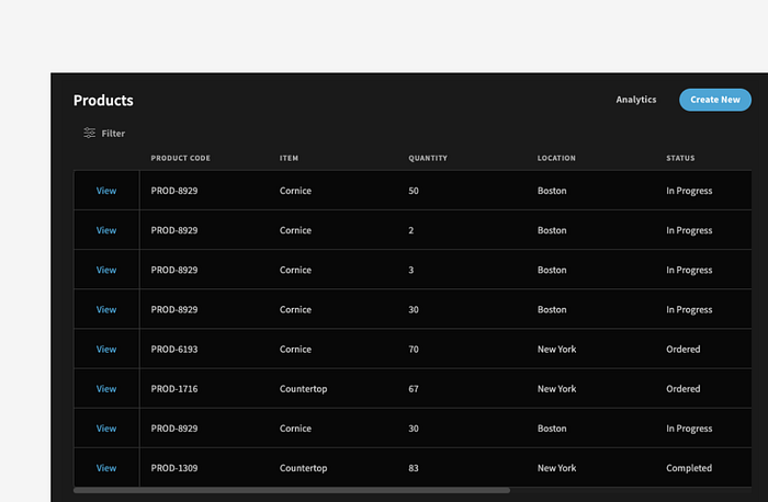
Table
A table is a type of data structure that organizes information into rows and columns. It is a common element of many user interfaces, as it allows for the easy visual comparison of data. Tables can be static or interactive, and can be used to display data from a variety of sources. When used in web design, tables can be a powerful tool for organizing content and improving the user experience.
Header
The header of a website is one of the most important aspects of the user experience. It is the first thing that users see when they come to a site, and it can set the tone for the rest of their experience. A well-designed header can make a website more inviting and easy to navigate, while a poorly designed header can make a site seem confusing and unorganized.
Footer
A footer is typically the last thing a user sees on a page, so it’s important to make sure that it’s well designed and easy to use. The footer should be easy to find and contain informations such as contact information, social media links, and copyright information. The footer should be designed to be easy to use and understand, and it should be consistent with the rest of the site’s design.
🤺 What challenged me
There were several challenges I encountered while learning about Common Component Definitions in UX design. First, it was difficult to find accurate and up-to-date information on this topic. Second, there were many different interpretations of what a Common Component Definition is, which made it difficult to know which one to follow. Third, it was challenging to understand how to apply this concept to my own work. Ultimately, I was able to overcome these challenges by doing a lot of research and asking for help from more experienced designers.
Thank you for making it this far.❤️


