Learning session 32: Selection Controls
Topic
Selection controls are the tools users select from to complete a task on a digital interface. They can be as simple as a checkbox or a radio button. The key to good selection control design is to make the controls easy to understand and use, while still providing the user with enough options to complete the task at hand.
What I learned
Form design would be incomplete without selection controls. They simplify the completion of forms and standardize the data collected. Usable, efficient forms increase conversion rates and prevent consumers from abandoning your product.
Understanding which selection controls to employ in different scenarios improves the usability of your forms. Knowing which icons to use for specific selection controls is also a crucial component of form design.
The most common selection controls are:
- Checkbox
- Radio Buttons
- Toggle Switch

Checkbox
A checkbox is a UI element that allows users to select multiple items from a list of options. Checkboxes are often used in forms to allow users to select multiple options, such as in a multiple-choice question.
Checkboxes are versatile UI elements and can be used in various ways to improve the user experience.
When designing a check box, you should keep a few tips in mind to create a practical and user-friendly check box:
- The check box should be placed in a location where it will be easy for users to find and click on.
- The check box should be large enough to be easily clicked on but not so large that it takes up too much space on the page.
- The check box should be accompanied by a label that clearly explains what action will be taken when the box is checked.
- A square checkbox makes your interface intuitive for the users.
- The check box is visible and easy to understand; users should be able to tell at a glance whether the box is checked or unchecked.

Radio Buttons
Radio buttons are a popular technique for users to make a single choice from a list of possibilities. Because the user may select only one radio button within the same group at a time, each accessible option must have its item and label.
When a user selects one of the radio buttons in a group, the group will be reset to display that the user didn’t select any radio buttons. One of the solutions is to add a “none of the above” button, which will automatically unselect the other radio buttons in the group.
There are a few tips to keep in mind while designing radio buttons:
- Use a consistent style for all radio buttons on a page. Keeping the style consistent will help keep the page looking clean.
- Ensure the radio buttons are large enough to be easily clicked or tapped.
- Use clear and concise labels for the radio buttons so that users know what they select.
- If there are a lot of radio buttons, group them so that users can easily find the one they are looking for.

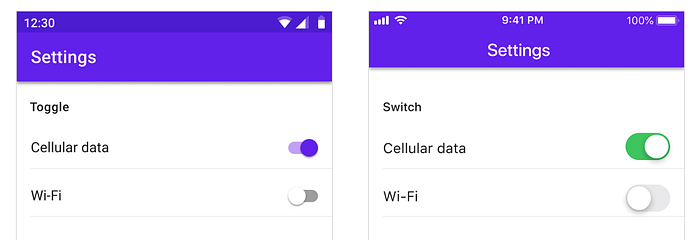
Toggle Switch
A toggle switch is a type of switch that allows the user to turn action on or off by simply flipping the switch. This type of switch is commonly used in applications where the user needs to be able to quickly turn action on or off, such as in a light switch.
The most common toggle switch we see is on our devices, for example, the Turn on/off Wifi toggle switch or Turn on/off Airplane mode. Toggle switches are also commonly used in UX design to allow the user to change between two states quickly.
Here are some tips to use when designing toggle switches:
- Keep the toggle switch large enough to be easily clicked or tapped.
- Make the switch visible and legible, even when off position — this will help users understand its purpose and function.
- Users should be able to understand what will happen when they toggle the switch, so think about how you can use visual cues to communicate this.
- Use labels or icons to indicate the state of the switch where; this will help users understand what they’re doing and avoid confusion.
- Test your toggle switch UX with real users to ensure it’s easy to use and understand.
My tries
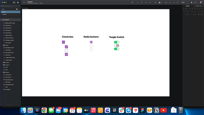
Here I practiced designing radio buttons, check boxes, and toggle switches in Sketch.
When a checkbox has multiple “child” checkboxes below it, and some are checked while others aren’t, the parent checkbox will be displayed in an indeterminate state. It’s generally signaled with a horizontal line or square.
What challenged me
I faced some challenges when learning about selection controls, like understanding how to use them to create a practical user experience properly. I had to do a lot of research and experimentation to figure out how to use selection controls effectively, and I’m still learning more about them.
Another challenge I faced, was finding good resources on selection controls. For example, some sites stated that the checkbox form should be circular, which frustrated me because it was ultimately the opposite of what I had learned. Then I spoke with several experienced designers, who informed me that not all of the resources you discover are real or beneficial.
I also had difficulty understanding what an Indeterminate state is utilized in checkboxes, so I discovered a video explanation that was much simpler to comprehend than just reading about it.
Thank you for reading this far. 😃
