Learning session 34: Cards & Menus
🚁 Topic
There are many different ways to design cards and menus. Some common methods include using icons, drop-down menus, and buttons. Each method has its own advantages and disadvantages.
🤓 What I learned
One of the most crucial components of creating great cards and menus is always keeping the user in mind.
- What information do they require?
- What is the most significant thing about this page? How can the design be simplified to make it more user-friendly?
When creating cards and menus, all of these concerns must be addressed. It is also critical to employ aesthetically appealing and easy-to-understand colors and forms.
Cards
Cards are a type of user interface design that uses cards as the primary unit of interaction. Cards are a versatile and flexible way to represent information and can be used for anything from a simple list of items to a complex and interactive dashboard. A card’s UI design is becoming increasingly popular, as it can be used to create beautiful and user-friendly interfaces.

Text card
All cards come in different shapes, the basic form of cards is text cards. Text cards contain a title and a secondary text.
The only acquiring element in a card is a container, the rest of the elements like text, video, images, etc are optional.

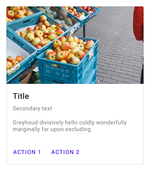
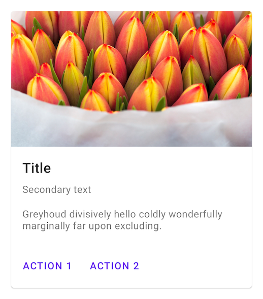
Rich card
Different from text cards, rich cards contain numerous complex information for example images, video, text, and links that draws the user’s attention and encourage them to interact with it.
One important thing to consider while designing cards is to give elements enough space and indicate hierarchy so that users can easily scan and comprehend.

User card
The social platform is overloaded with user cards. The primary goal is to provide users information like a username, image, or avatar, but also may include a CTA button like “Follow, Connect, Call”

Flat cards
Flat cards don’t contain shadows or outlines to give depth to the design, for many reasons flat cards are challenging to design. To make them stand out from the background we can use some visual cues, such as a different color background.
Outlined card
Similar to elevated cards, outlined cards draw the user’s attention and group items into a single unit. Instead of using shadows to make the card stand out from the rest of the page, they use a border stroke to highlight the content. Outlined cards are flat cards, that way it doesn’t encourage the users to interact as same as elevated cards
Elevated card
Elevated cards different from outlined cards use shadows to stand out from the rest of the page, floating above the background. Shadows help indicate clickability and enhance the unity of the elements within one card, also encouraging the users to interact with your product.
Menus
Cascading menu
A basic dropdown menu is a list of items that can be selected by clicking on a button or link. The items in the list are usually displayed in a dropdown menu. When an item is selected, the menu will close and the selected item will be displayed in the button or link.
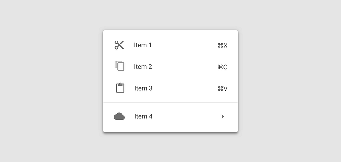
Contextual menu
A contextual menu is a menu in a graphical user interface that appears upon user interaction, typically a right-click mouse operation. A contextual menu offers functionality that is specific to the context of the user’s action. For example, if the user clicks on a text document, a contextual menu might offer options such as “cut,” “copy,” and “paste.” If the user clicks on an image, the contextual menu might offer options such as “rotate” or “crop.” Contextual menus are common in modern operating systems and applications.
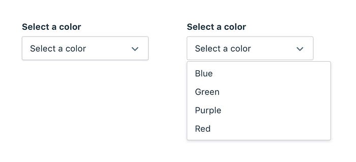
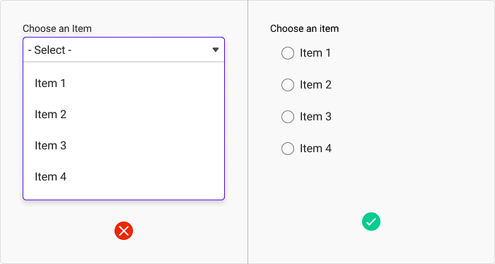
Single-select menu
A single-select menu is a drop-down menu that only allows one selection to be made at a time. When an option is selected from the menu, the other options are hidden from view. This type of menu is commonly used when there is a limited number of options to choose from, and the user only needs to make one selection.
The best selection tools are single-select menus, especially when filtering.
Multiselect menu
Multiselect menus allows the users to choose more than one list item at the time. A multiselect menu is a type of drop-down menu that allows the user to select multiple options from a list of choices.
Multiselect menus are often used in online forms and surveys, as they allow the user to select multiple options without having to scroll through a long list of choices.
When designing for mobile devices, multiselect menus are not recommended since they take up so much room that it is impossible to use that area for mobile apps.

Search Menu
A search menu is a powerful tool that allows you to find what items to fulfill your needs. You can search by keyword, category, or even brand. The search menu is easy to use and makes finding what you need quick and easy.

Inline menu
Inline menus expand upon click just like conventional dropdowns do. Consider them to be sorting menus. Inline menu is a type of menu that is embedded within a document or web page.
It is typically used as a way to provide quick access to a list of options or commands. It is possible to design a dropdown menu such that it displays within other material.
Menu scrolling
Menu scrolling allows users to scroll through a list of options over the menu and moving up or down. This can be useful for long menus with lots of options, or for menus that change frequently. When designing a menu scrolling is important to add a scroll bar.
If there are more options, scrolling might get very monotonous. You may fix this by including a search option in the menu, allowing users to locate what they’re looking for quickly and easily.
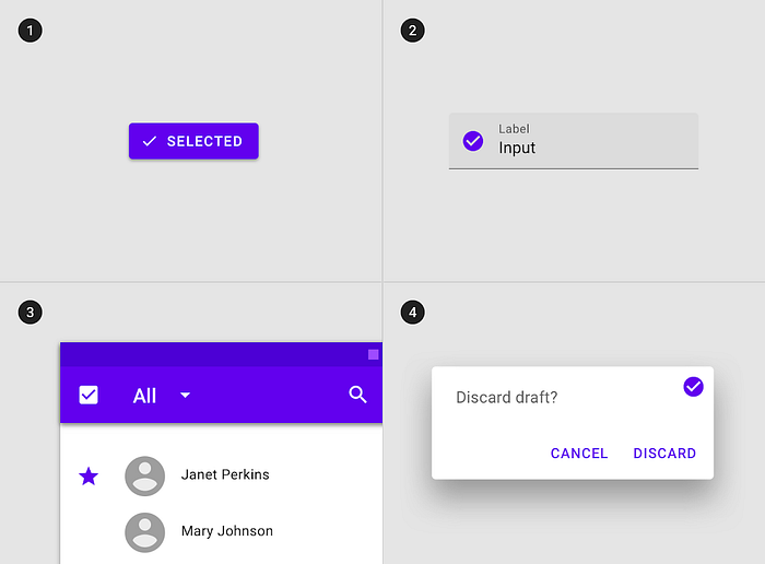
Selection state icon
The selection state icon is a small icon that appears in the top-right corner of an item when it is selected. This icon allows the user to quickly see which items are selected and deselect them if necessary.
Leading icons
Leading icons are a type of user interface design that uses icons to represent different actions or functions. Leading icons are often used in mobile apps and websites.
They can be used to represent different menu items, social media sharing options, or even different pages on a website. Leading icons are typically easy to understand and use.
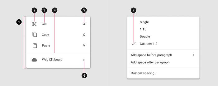
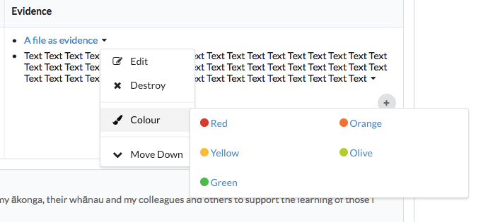
Divider
Consider employing a divider if you need to group things within a single menu. Dividers are generally a faint horizontal line that separates menu sections.
Dividers helps in the organization of similar objects. At the same time, they visually distinguish distinct item groupings without the need for separate menus.
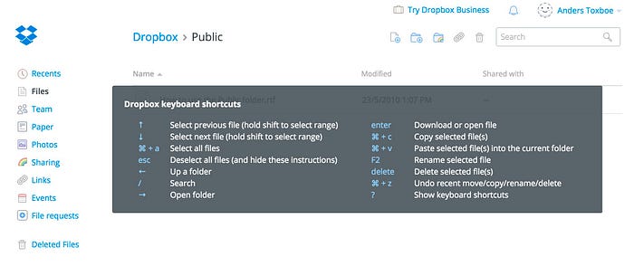
Keyboard shortcuts
Keyboard shortcuts are a great way to improve the UX of your website or application. They can help users navigate your site more quickly and easily, and can also help reduce the number of clicks or taps required to complete a task.
My Tries

🤺 What challenged me
One of the many challenges I faced when learning about cards and menus was figuring out how to use them effectively. I had to experiment with different techniques and try different things before I found what worked best for me. There are a lot of specific terms used to describe different aspects of cards and menus, and it wasn’t easy to keep track of them all.
Another challenge was creating a practical and visually appealing card or menu. Additionally, I had to learn how to read and understand the various types of cards and menus to make the best choices for my needs.
Thank you for making it this far. 😀
