Learning session 33: Inputs & Forms
Topic
Inputs and forms are an essential part of UX design. They help designers create user interfaces that are easy to use and understand. By understanding how users interact with inputs and forms, designers can create better user experiences.
What I learned
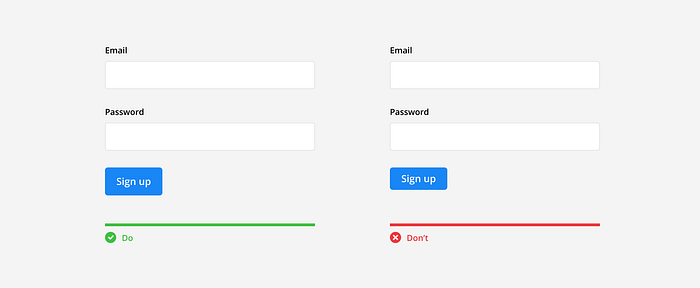
Designing successful forms that users interact with requires an understanding of the many sorts of form inputs and when to utilize them. Low conversion rates result from poorly designed inputs that might lead users to stop performing the action they were.
The foundation of many websites is filled-out forms, whether they be search forms, contact forms, registration forms, or other types. Without forms, users would have few options for interacting with or getting in touch with a company, and e-commerce wouldn’t even be possible.
The form experience may be improved by designing highly useable, straightforward forms with appropriately structured inputs. Even though most users may never enjoy filling out forms, but if the process is simple and effective, they won’t mind doing it.

Single-Line Input
The single-line inputs allow users to type a single line. Forms such as signup forms requiring only users’ names and email addresses are built with single-line inputs. They’re also suitable for collecting short answers such as addresses, passwords, and similar data.
The input should be clearly labeled and the user should be able to see the data they are entering. The input should be easy to use and the user should be able to quickly and easily enter the data they need.

Multi-line Input
Multi-line inputs are preferable to single-line inputs if users must give longer-form replies. Although multiple-line inputs initially resemble single-line inputs, they enable users to write lengthier responses by extending vertically as necessary to fit the text.
They’re a great choice for small layouts that nonetheless need users to type a lot of information, such as when gathering survey responses or other comparable data.

Text Area
Due to the fact that text areas allow users to add more than one line, multi-lines are similar to text areas. The only differences between these input types are the text area’s fixed height and the application of vertical scrolling when text crosses the input’s constraints.

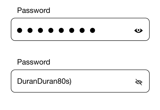
Password Input
When designing a form for users to input their password, there are a few key factors to keep in mind. The password field should be clearly labeled so that users know what they are supposed to input. Foreward the password field should be masked so that users’ passwords are not displayed as they type.
Also, the form should check to make sure that the password meets certain criteria for example minimum length, maximum length, required characters, etc. Last but not least, the form should give the user the option to show their password so that they can double-check that they have inputted it correctly.
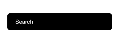
Search Input
Users can utilize search inputs to navigate the site’s content (or beyond), and they occasionally have auto-complete options that rapidly show the most popular search results.
In the search input part of the UX form, you will need to provide the user with a way to search for items. This can be done by providing a search box that allows the user to enter in a search term. Alternatively, you could provide a drop-down menu that contains a list of items that the user can select from.
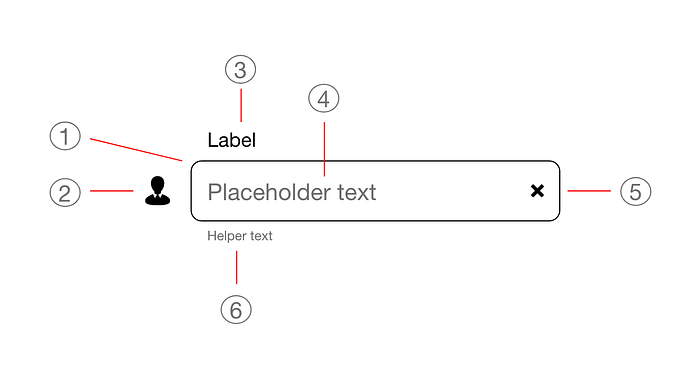
Placeholder
A placeholder is a part of the UX form that allows users to input information. This can be used to input a name, email address, phone number, or other information. Placeholders can be used to help guide users through the form and make it easier for them to input the correct information.
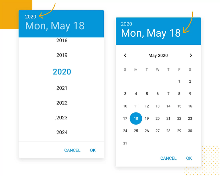
Calendar Input
A calendar input is a part of the UX form where users can input dates. This can be used to input the date of an event, a deadline, or anything else that requires a date. The calendar input is a convenient way to input dates, and it is often used in conjunction with other input methods, such as a date picker.
Select Input
A select input is a type of input field that allows the user to select from a list of options. The options can be presented as a drop-down list, or as a list of radio buttons.
The select input is an important part of the UX form because it allows the user to choose from a list of options, instead of having to enter their own data. This can be helpful when the user is unsure of what they want, or when they need to select from a list of predefined options.
Action Input
Action inputs consist of an input field and a submit button, which typically verifies if the data supplied is accurate or appropriate. Such inputs are used by designers to validate data simply in a single particular input.
Action inputs are available to users in many different contexts, such as during the checkout process when using a coupon code with the Send or Search, buttons to conserve space and lessen friction.
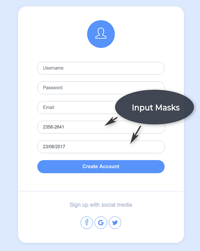
Input Mask
An input mask is a string of characters that represents a preset format for entering data into a field. The mask ensures that the data entered conforms to the preset format by displaying only the characters that are allowed in that particular field. Input masks are often used to ensure that data conforms to a specific format, such as a phone number or date.
They can also be used to limit the amount of data that can be entered into a field. For example, an input mask for a phone number might only allow 10 characters to be entered, even if the field can hold more.
My tries
What challenged me
One of the challenges I faced while learning about inputs and forms UX design was trying to figure out how to design the inputs in a way that would be user-friendly and easy to understand. I also struggled with making sure that the inputs were properly aligned and spaced out so that they would be easy to fill out. Another challenge was making sure that the labels for the inputs were clear and concise so that users would know what information they were supposed to enter.
Thank you for making it this far. 😃


