Learning session 37: Introduction to search
Topic
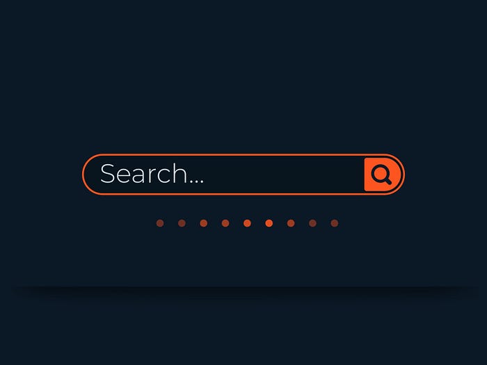
A search bar is a key component of any good UX design. It allows users to quickly and easily find the content they’re looking for, whether it’s on your website or within your app.
What I learned
Search is a part of any website or apps. Search functionality is a part of the navigation system, where it can help users to find easily and quickly the information they are looking for at a page or at a website.
Search bar should be easy to find by users in any page, and its placed in a top right or in top left corner of a website. A well-designed search bar can make a big difference in the user experience, and can help users find what they need in a matter of seconds.

Position search where users expect it to be
As I mentioned earlier the search bar should be easily and quickly found by users.
In 2006 there a study was conducted by A. Dawn Shaikh and Keisi Lenz about re-examining user expectation for web objects to be located on a web page.
The results from the users were:
The internal search engine is expected to be located at the upper-center of a page
So users commonly find that the search bar is at the top left or right corner of a web page.

Accompany search input with the appropriate icon
Using a simple search icon in a product can help users find what they are looking for quickly and easily. Additionally, using a simple search icon can help to keep the overall design of the product clean and uncluttered.

Use a proper input size
The search input should be wide enough to fit a search text.
A search input size should be wide enough to fit a typical search query. Short search inputs necessitate the use of fewer and shorter terms, causing incorrect search queries and bad search results decrease the user experience.
Jakob Nielsen from “The Nielsen Norman Group” recommended an ideal width of 27 characters for the search input size.

Provide a sample search query
When designing a product, it is important to provide a sample search query in order to help users understand how the product works. This is especially important for products that are search-based, such as search engines or e-commerce.
By providing a sample search query, users can see how the product works and what they can expect when they use it. This can help to improve the user experience and make the product more user-friendly.

Accompany search input with the button
Many users are accustomed to submitting their search term by clicking a button. Make sure the button has a distinguishing color and is adequately sized so that users can easily notice it and click it.
By using a button users will be able to easily find the search button and will be able to use it more effectively.

Search auto-suggest
An auto-suggest search is an important part of product UX design because it allows users to quickly find the information or content they are looking for.
By automatically suggesting search results based on what the user has typed in, it saves them time and frustration from having to manually search for what they need. This type of search is especially important for large sites with a lot of content, or for ecommerce sites with a large inventory.

Rich search auto-suggest
There are both pros and cons to using a rich auto-suggestion search in a product. On the one hand, it can be helpful in terms of providing users with suggestions for what they may be looking for. This can save time and effort on the part of the user, as they may not have to manually search for what they need.
On the other hand, there is the potential for the suggestions to be inaccurate or not relevant to what the user is actually looking for. The rich research auto-suggest contains a numerous of information that can overwhelm the users.
Show recent search requests
It’s inconvenient when you try remembering searching for something but can’t recall what it was. By integrating recent search queries in the dropdown, the dropdown will present prior search words as recommendations based on the current query as soon as the user begins typing.
Showing recent search queries is about respecting users and making their experience in your product enjoyable by requiring them to just identify and pick one of your choices.

Show related search requests
The other option to help user find easily what are they looking for is showing related search request. Where before the users start typing, you can show related or trending search queries. Users may find what they require before using the Search button.

Search on mobile
It is hard to design a search in a mobile UX design because the screen is small and there is limited space to work with. The search must be concise and easy to use, otherwise users will get frustrated and give up.
Minimizing user activities is one of the first things you can do to improve user experience on mobile. Provide intelligent search recommendations, integrate recent searches, and minimize visual clutter. Make sure the search icon is easy to spot on a page, especially if searching for information is one of your app’s most popular functions.

What challenged me
One challenge I had when learning about the search bar’s main primary goal was understanding how to design one that is effective and user-friendly. There are many factors to consider when designing a search bar, such as the layout, color, size, and placement on a page.
It can be difficult to find the right balance of these elements to create a search bar that is both aesthetically pleasing and functional.
Thank you for making it this far.
