Learning session 38: Breadcrumbs
Topic
Breadcrumbs are often used as a navigational component, as they allow users to keep track of their location within a website or application. They can also be used to provide an overview of the structure of a website or application, and to help users orient themselves within it.
What I learned
Breadcrumbs are a type of navigation that can be used to help users understand their current location within a website or app. They are typically displayed as a series of links, each representing a different page or level within the hierarchy.

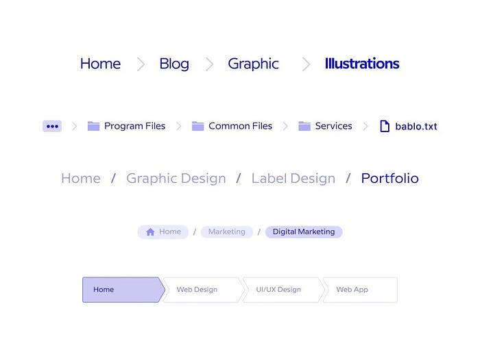
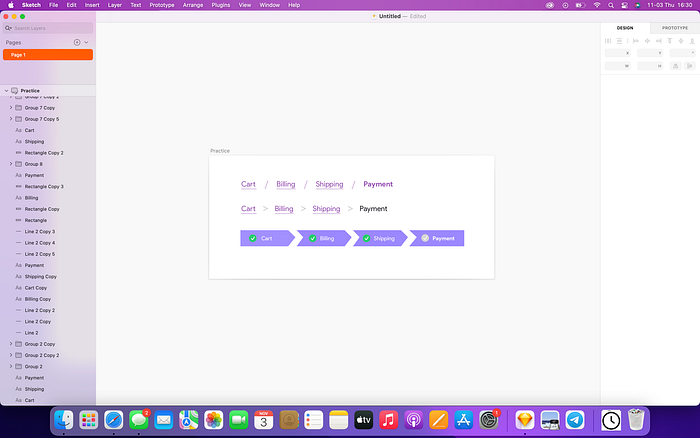
Text breadcrumbs
Text breadcrumbs are text links where that are arranged horizontally and are separated by dividers. The last breadcrumb represents your location on a certain page. The breadcrumb that is indicating the current page should only be text and not interactive like a link.

Button breadcrumbs
Using buttons in breadcrumbs extend the touch area and improves visibility. Designing these buttons to show the way is a smart concept for breadcrumbs.

Avoid using breadcrumbs for websites with linear structure
Breadcrumbs are typically used on websites with a hierarchical structure, where users can navigate through different levels of content. However, on websites with a linear structure, breadcrumbs can be confusing and unnecessary.
If every page on the website is part of a linear sequence, it is clear what the next and previous pages are, so breadcrumbs are not needed. In addition, breadcrumbs take up valuable space on the page that could be used for other content. For these reasons, it is best to avoid using breadcrumbs on websites with a linear structure.
Breadcrumbs should be visible
Breadcrumbs are an important part of any website’s design, but they should never be the first thing a user notices. They should be visible, but not intrusive, and should always be easy to find.

Use the most common divider style
The most common divider style for breadcrumbs are:
- Slash ( / )
- Chevron icons ( >)
- Arrows ( → )
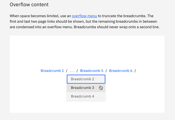
Use overflows for better scanning
Breadcrumbs are a great way to help users navigate your website. By using overflow, you can help keep your breadcrumbs visible. Overflow can also help keep your breadcrumbs from taking up too much space on your screen.
Due to overload, be sure you give users access to the hidden pages. We suggest including the extra pages in a menu control.
Be consistent with styling the dividers
The secret to developing a wonderful product that is user-centered is consistency. Instead of having to learn new words or features every time they visit a page, consistency in design allows users to concentrate on what matters. Be careful when employing a style consistently if you choose just one.
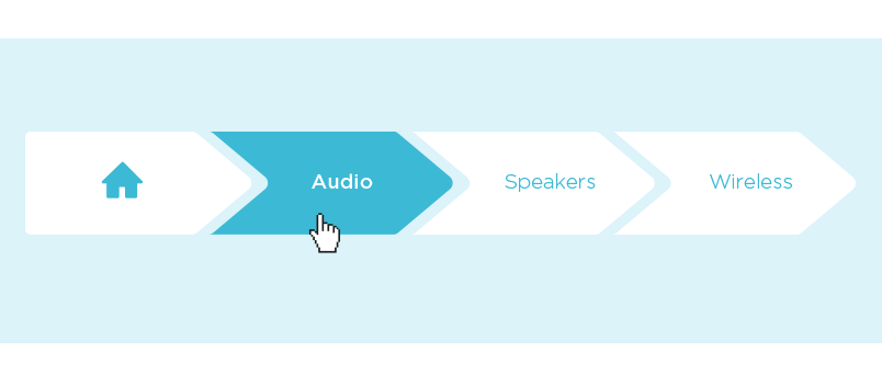
Previous pages should be interactive
There will always be at least one prior page in a breadcrumb trail. Given that they are interactive, they should be styled differently from the current page. The Home page should always be reached via the first link.
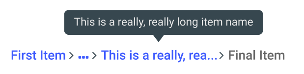
Truncate long labels in breadcrumbs
Breadcrumbs are a great way to keep track of where you are on a website, but sometimes they can get a little bit longer. When this happens, you can truncate the label so that it fits within the breadcrumb. To do this, simply add an ellipsis (…) after the label. This will cut off the label but still remains functional.
My try
What challenged me
While breadcrumbs can be a helpful way to orient users, they can also be challenging to learn and design. One of the challenges in designing breadcrumbs is understanding how to present the hierarchy in a way that is clear and easy to understand. This can be difficult to do, especially if the website or app has a complex structure. Another challenge that I encouraged was understanding how to incorporate them into my designs in a way that would be both helpful for users and consistent with the overall look and feel of the design.
Thank you for making it this far.
