Learning session 42: Charts
Topic
In UI/UX design, charts are often used to visualize data in a way that is easy for users to understand. By using colors, labels, and other visual cues, charts can make it easy for users to see patterns and trends in the data.
What I learned
Charts are a graphical representation of data, they can help users visualize and understand data. Charts can be used to show trends, patterns, and relationships, and they can be used to compare data.
Charts can be used to make data more accessible and understandable, and they can be used to help users make better decisions.

Bubble charts
A bubble chart is a type of data visualization that displays data in the form of circles. The size of each circle represents a different data point, and the colors can be used to represent different groups or categories.
- The advantage of a bubble chart is that it can display data for three variables in a single plot. This can provide a more complete picture of the data than two-dimensional plots.
- The disadvantage of a bubble chart is that the size of the bubbles can be difficult to interpret.

Radar charts
Radar charts are a great way to compare multiple data sets and display them in a way that is easy to understand.
- The main advantage of radar charts is that they can be used to visualize data in a way that is easy to see patterns and trends.
- One downside of radar charts is that they can be difficult to interpret if the data sets are complex. Another downside is that radar charts can be difficult to create if the data sets are not well organized.

Pie charts
Pie charts are used to show how data is distributed across different categories. They can be used to show how a company’s sales are divided across different products, or how a country’s population is divided across different age groups.
Pie charts are easy to understand and can be used to compare different data sets. However, there are some drawbacks to using pie charts. They can be difficult to read if there are too many categories, and it can be hard to compare data sets.

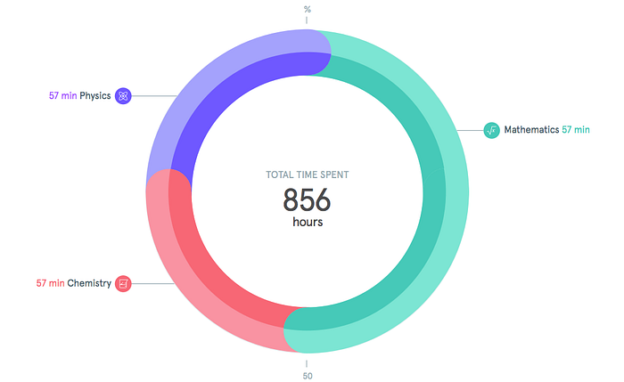
Donut charts
Donut charts are a great way to visualize data in a way that is both visually appealing and easy to understand. When designing a donut chart, there are a few things to keep in mind in order to create an effective and user-friendly visualization.
It is important to use a consistent color scheme throughout the entire chart. This will help to create a cohesive and visually appealing design. Additionally, it is important to use a clear and easy-to-read font.
The last thing you want is for your users to have difficulty understanding the data due to poor design.
Bar charts
Bar charts are one of the most popular ways to visualize data, and for good reason. They are easy to understand and interpret, and can be used to compare data points side-by-side. When designing a bar chart, there are a few things to keep in mind.
First, the bars should be of uniform width and spacing. This will make the data easier to read and compare. Second, the bars should be labeled clearly, so that the viewer knows what data is being represented.

Line charts
Line charts are a type of graph that is used to display data over a period of time. They are typically used to track changes or trends over time and can be used to show data for both linear and non-linear data sets. Avoid adding too much data or using complex designs.
- Use a consistent scale
- Use clear and concise labels
- Use colors wisely
- Keep it simple

Area Charts
Area charts are a type of chart that visualizes data using a series of connected line segments. The area between the line segments is usually filled with a color or pattern to indicate the magnitude of the data.
Area charts are a useful tool for visualizing data that changes over time, such as sales data, population data, or any other data that can be plotted on a line chart.

Scatter charts
A scatter chart is a type of chart used to display data points on a two-dimensional coordinate system. The data points are plotted on the chart according to their x- and y-values.
The main advantage of using a scatter chart is that it can show relationships between data points that might not be immediately obvious when the data is displayed in other ways.
Scatter charts can be used to:
- Show the relationship between two variables
- Find out if there is a correlation between two variables
- Compare two or more sets of data
- Visualize data that is hard to see in other ways

What challenged me
One challenge I had while learning about charts in UI/UX design was understanding all of the different types of charts and when to use each one. There are bar charts, line charts, pie charts, area charts, and many more. Each type of chart has its own strengths and weaknesses, so it is important to choose the right chart for the data you are trying to visualize.
Another challenge was understanding how to design charts that are both effective and visually appealing. This involves choosing the right colors, fonts, and layout for the chart.
Thank you for making it this far.